How PRINT looks, and why.
PRINT is an independent Canadian magazine. It has no advertisers and no investors, so the only thing the look has to serve is the reader and the record. This page is the live state of that look: the mark, the palette, the type, the pictures, and the rules that do not bend.
The mark
PRINT in Playfair Display, weight 900, tight. Canada beneath it in UnifrakturCook blackletter. White on dark, black on light, never recoloured.
Colour
Black ink on white paper, one press red for emphasis, and a small range of greys. That is the whole palette.
Typography
A Didone for display, a quiet serif for reading, a mono for labels, and a blackletter for one word only.
Pictures
Every article carries one original illustration, never a stock photograph. A different illustration tradition each time, so the magazine reads like it has a stable of artists. Every image wears the cover-mark.
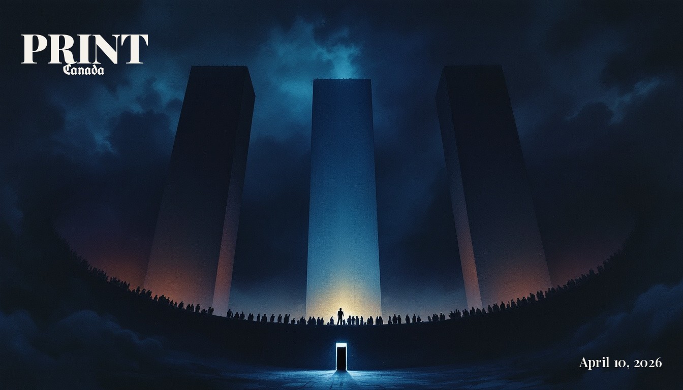
An article hero, branded. One bold metaphor, one chosen tradition.
PRINT top-left, the article date bottom-right. Colour is chosen automatically from each corner so it always reads. Text is never baked by the image model; it is stamped cleanly afterward.
Each picture is a single conceptual idea, the New Yorker "aha". Dignified on grave subjects, witty on absurd ones. No real brands, no identifiable people, no words inside the art.
A rotating library, referenced for technique only, never copied:
Voice and standards
The look serves the writing. The writing has rules that never bend.
Every story is told from the side of the citizen against the institution. The court, the hospital, the bank, the border desk, the benefits office, judged by what they deliver to the person in front of them.
Commas, periods, and new sentences carry the rhythm. Anywhere, ever.
No plaintiff or accused names, no defendant company names, no file numbers. Cities and ages are permitted. Litigation subjects are protected.
On contested facts we state what is established, what is alleged, and what is unconfirmed, separately. Nothing is invented to make a case sharper than the facts allow.
Retrospectives are dated to their event so the archive spans the era, and every one carries a visible "published 2026" label. We never present a look-back as live reporting.
The structure
Three rooms. No more.
Published by PRINT Canada. The art department is run by the Art Editor; the cover-mark and the style library are theirs to keep consistent. This page reflects the current state of the brand and is updated as it changes.